

Another way of avoiding the chop


Thanks to the new highlight feature on Twitter,
you can now see my chart-only tweets by clicking here 👍
Another way of avoiding the chop
After 3 losing trades in a row, this normally is a good sign to me that I could be trading in the middle of a fk zone. Whenever this happens, I usually draw a box.
Every time price makes a new high or low (and then trades back on itself), I would extend this box. Although this is a great idea that has served me very well over the years, it can cause us to miss some cracking trades.
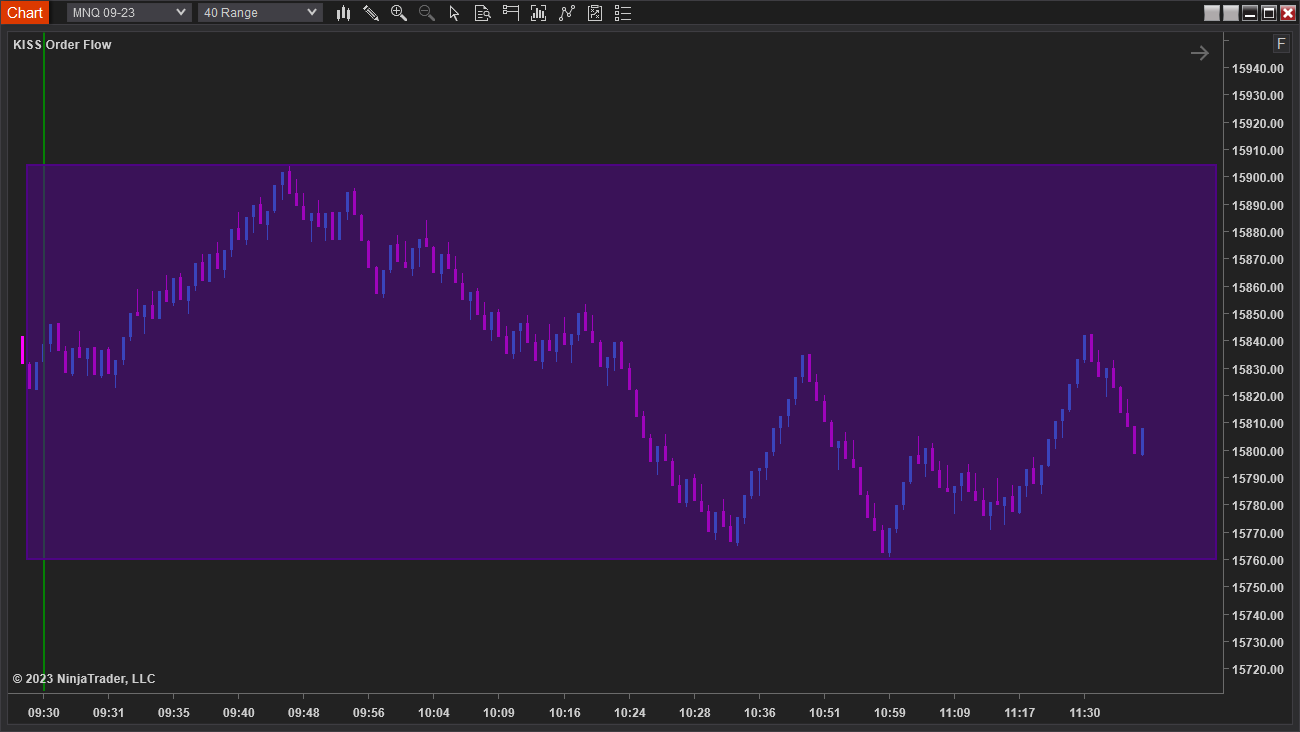
E.G. This is what a fk zone box would’ve looked like on Thursday:
Not ideal because as you can see, there were a few decent runners in here.
Let me introduce you to the concept of ‘localised fk zones’. This idea came to me earlier this week. Instead of drawing a box, we do this:
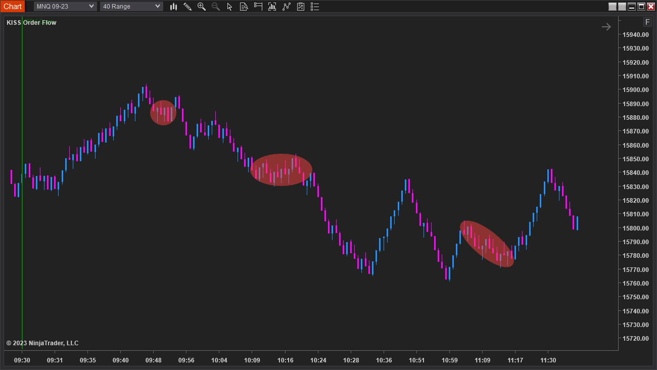
1) Recognise that we’re fking around in a small area
This is very easy to see when using a range chart. We get pink and blue bars tightly packed together and price doesn’t cleanly move far in either direction:
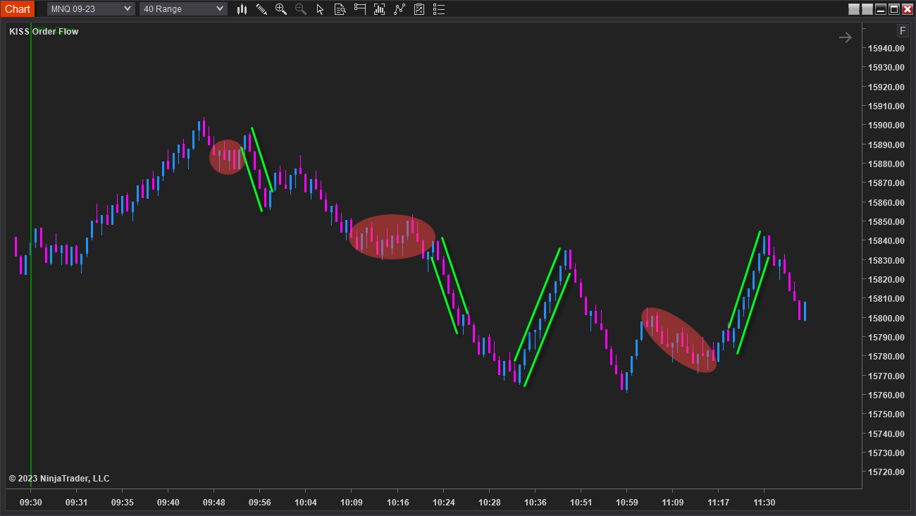
2) Wait for a big push away from this area
This is also very clear to see as we’ll get a run of several consecutive pink or blue bars:
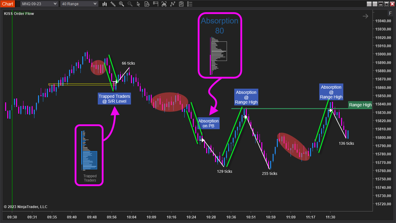
3) Look for a reversal or continuation trade
After a run, we’re either going to continue on in that direction, or reverse. I’ll look to the kissorderflow.com indicator to decide which way to trade it.
Here are some examples:
Some traders might be tempted to code this up to automate localised fk zones…
But wait! ⛔️
I do not believe it would work long-term to simply write a check for X consecutive bars. We really do need to FEEL the move away from a localised fk zone.
If you’re getting chopped up, it seriously is worth waiting for these big pushes away. It prevents us from going into unnecessary drawdown, and there are some pretty decent trades to be had at the end of these little bursts of movement.
In fact, because of them, I had my best day when trading my prop accounts on Thursday. Here are some of the trades that I got:

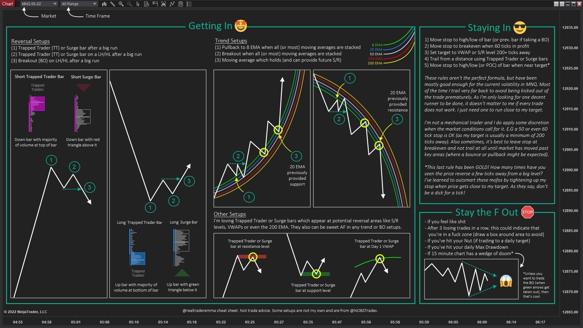
Cheatsheet
N.B. The following whilst still helpful, is slightly out of date. I am working on updating this. Please my highlighted tweets which show the newer chart layout that I’m using.
Here you go guys, my cheatsheet. There’s no space to cover the chart setup, please see details below:
40 Range Chart (my execution chart)
- 5 EMAs (8, 20, 50, 100 and 200)
- kissorderflow.com (Trapped Trader bars turned on: Max 6, Min 20)
15 min (my Big Picture chart)
- Day 1-5 VWAPS plus Weekly and Monthly VWAP
- Session high and low levels are enough for me, but you can go crazy
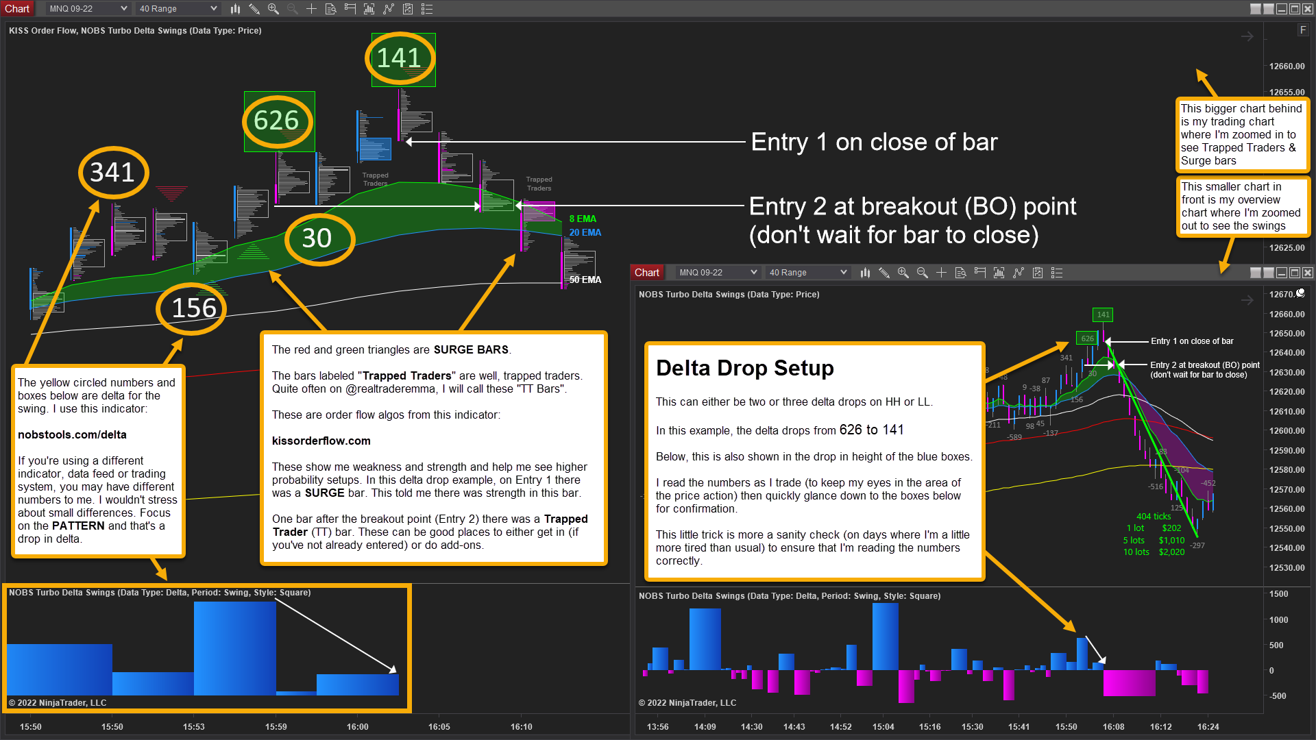
Delta Drop Setup
I’ll share what I’m using. I wouldn’t get too hung up on seeing the exact data. Small differences in delta largely do not matter. The same patterns will still be there.
nobstools.com/delta - For Swing Delta
kissorderflow.com - Simplified order flow bars that show me:
Absorption
Trapped Traders
Buy or Sell surges
ninjatrader.com - Platform
I will never send you a message trying to sell you something, whether that’s mentoring, “holy grail” indicators and/or trading systems, or anything else like that. If you get a message from ‘me’ that’s asking for money, that WON’T BE ME. Please block and report these mofos.
This newsletter will always be 100% free and 100% spam free.
Your email will never be sold to any fucker.
Not trade advice! Please see about page for financial disclosure.